Cornelison, T. L., & Clayton, J. A. (2017). Considering Sex as a Biological Variable in Biomedical Research. Gender and the Genome, 1(2), 89-93. Reproduced by permission of the authors. (Cornelison and Clayton 2017)
“… hypotheses need to be specific about whether the question is being asked in relation to men and women or only one sex - if the trial is carried out only on one sex, it needs to be made clear that the findings may only be applicable to that sex…”
This tutorial is prepared using the following references
Tidyverse Skills for Data Science, https://jhudatascience.org/tidyversecourse/
Alexander, R. (2023). Telling Stories with Data: With Applications in R. CRC Press. (Alexander 2023)
# read Excel file into Rdf_excel <-read_excel("myspreadsheet.xlsx")
A few features of read_excel()
converts blank cells to missing data (NA)
sheet: argument specifies the name of the sheet from the workbook you’d like to read in (string) or the integer of the sheet from the workbook.
col_names: specifies whether the first row of the spreadsheet should be used as column names (default: TRUE). Additionally, if a character vector is passed, this will rename the columns explicitly at time of import.
skip: specifies the number of rows to skip before reading information from the file into R.
Often blank rows or information about the data are stored at the top of the spreadsheet that you want R to ignore.
Comma-separated values (CSV) files
We can use function read_csv() in tidyverse to reads csv file
By default, read_csv() converts blank cells to missing data (NA).
col_names = FALSE to specify that the first row does NOT contain column names.
skip = 1 will skip the first row. You can set the number to any number you want.
n_max = 100 will only read in the first 100 rows. You can set the number to any number you want.
Other packages for data import: - package readr reads txt, csv, Rdata (or rda). - package haven reads SPSS, Stata, and SAS files.
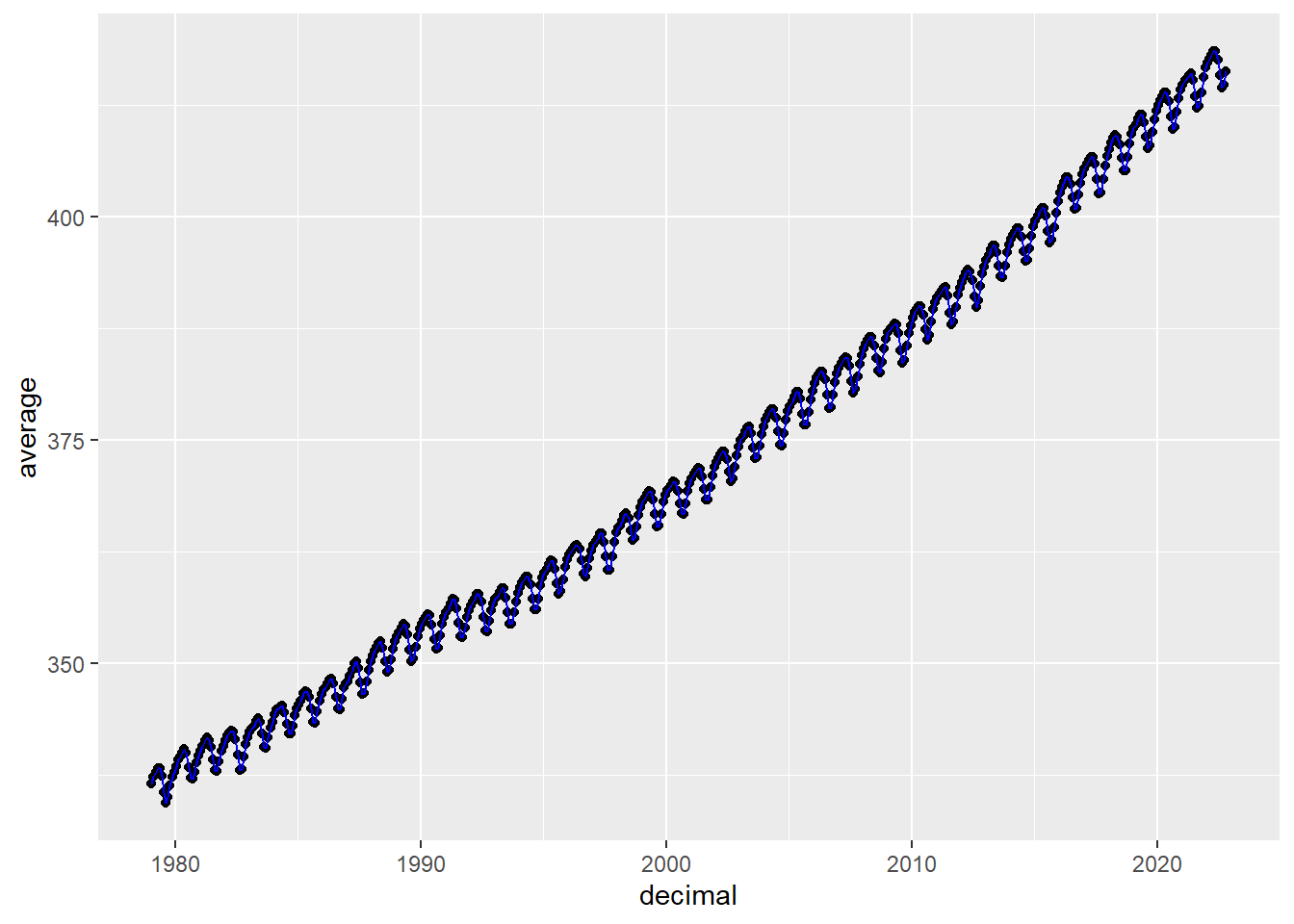
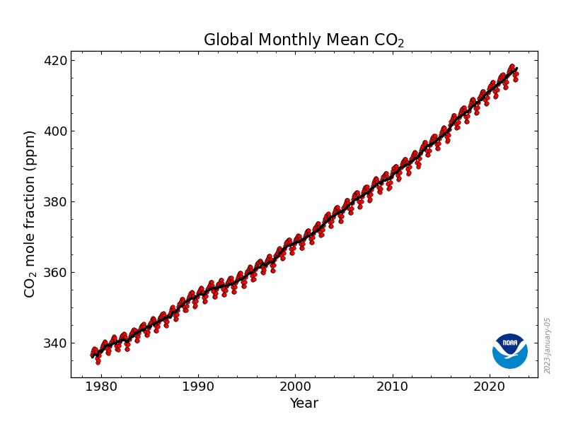
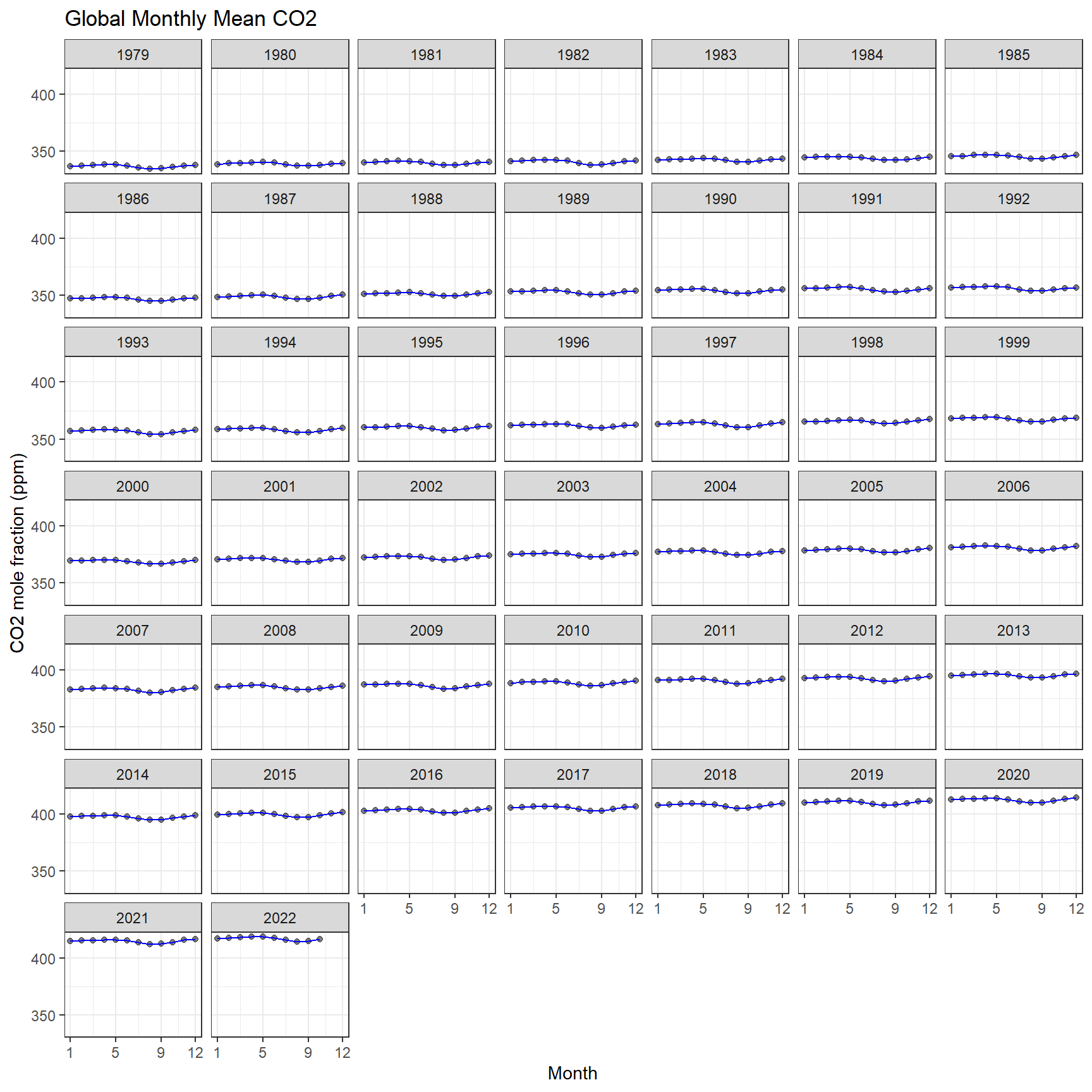
For this tutorial, we will be working with the co2_mm_gl_clean.csv dataset
This data contains monthly globally averaged CO2 records between 1979 and 2022.
Lan, X., Tans, P. and K.W. Thoning: Trends in globally-averaged CO2 determined from NOAA Global Monitoring Laboratory measurements. Version 2023-01 NOAA/GML (https://gml.noaa.gov/ccgg/trends/)
# creating new variables based on conditions of another variable;# suppose we want to create a year group variable;co2 %>%mutate(year_group =case_when( year <1980~'1970-1979',1980<= year & year <1990~'1980-1989',1990<= year & year <2000~'1990-1999',2000<= year & year <2010~'2000-2009',2010<= year & year <2020~'2010-2019',2020<= year & year <2030~'2020-2029', )) %>%head()
co2 <- co2 %>%#updating the data objectmutate(year_group =case_when( year <1980~'1970-1979',1980<= year & year <1990~'1980-1989',1990<= year & year <2000~'1990-1999',2000<= year & year <2010~'2000-2009',2010<= year & year <2020~'2010-2019',2020<= year & year <2030~'2020-2029', ))
Grouping and Summarizing Data
we can use group_by() and summarize() to help calculating group-based statistics
Example: suppose we want to calculate average, min, and max co2 by years (aggregated over month)
co2 %>%select(year, average) %>%group_by(year) %>%summarise(`mean co2 by month`=mean(average),`min co2 by month`=min(average),`max co2 by month`=max(average) )
The function requires the following arguments - a data frame - cols: name of the columns we wish to gather - names_to: name of the new column - values_to: name of the new column containing variable values
suppose we want to reshape the long co2 data to wide data with month 1 to 12 as columns
geom_vline: Reference lines: horizontal, vertical, and diagonal
labs, axis, facet, and theme
ggplot(aes(x = month, y = average), data = co2)+geom_point(alpha =0.5) +geom_line(color ="blue") +labs(x ='Month',y ='CO2 mole fraction (ppm)',title ='Global Monthly Mean CO2' ) +scale_x_continuous(breaks =c(1,5,9,12)) +scale_y_continuous(breaks =seq(from=300,to=450,by=50)) +facet_wrap(vars(year)) +theme_bw()
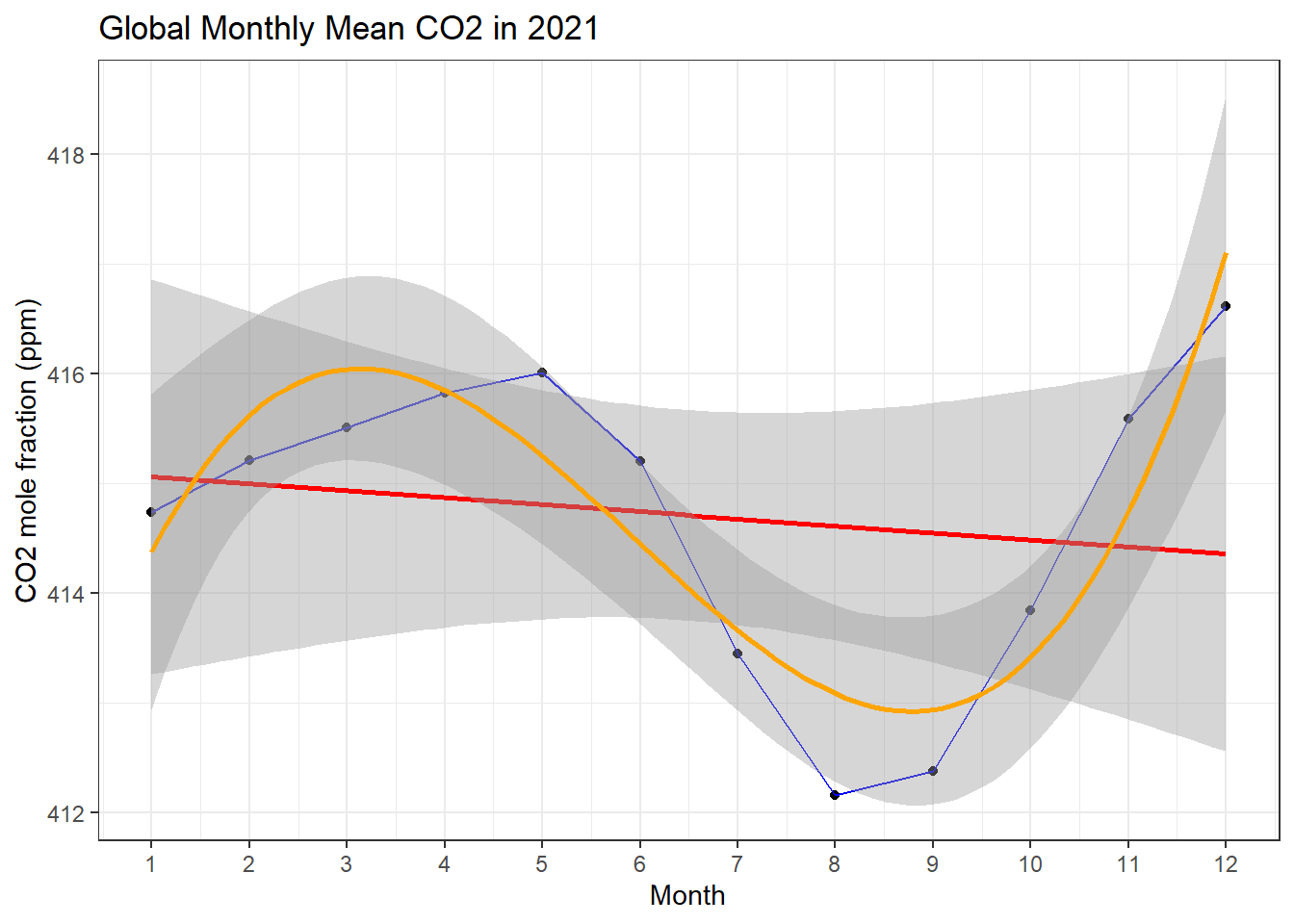
adding statistics
co2 %>%filter(year ==2021) %>%ggplot(aes(x = month, y = average))+geom_point() +geom_line(color="blue") +geom_smooth(formula = y ~ x, method ='lm', color ="red") +geom_smooth(formula = y ~ splines::bs(x,3), method ='lm', color ="orange") +scale_x_continuous(breaks =seq(1,12,1)) +labs(x ='Month', y ='CO2 mole fraction (ppm)', title ='Global Monthly Mean CO2 in 2021')+theme_bw()
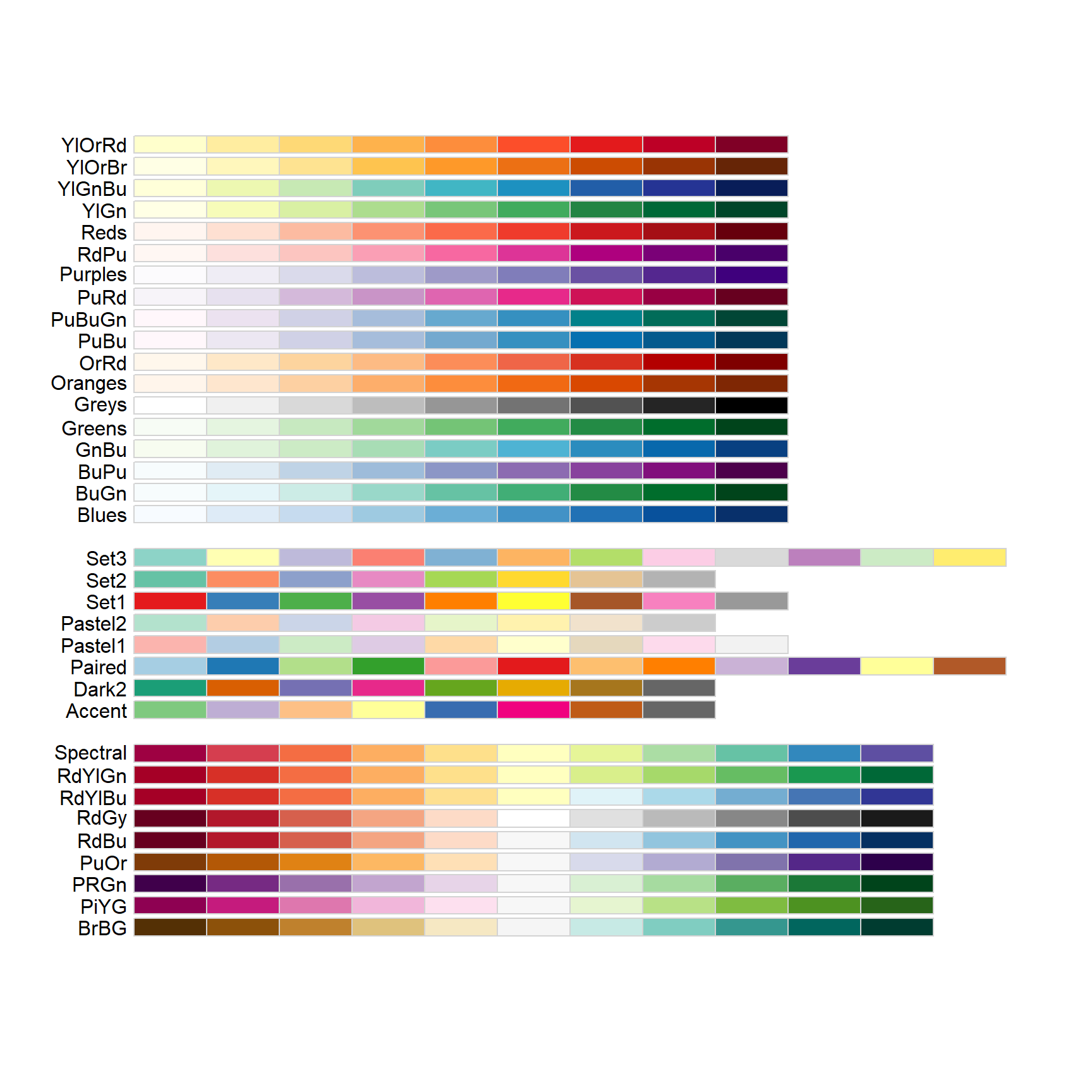
colours in R
require(RColorBrewer)display.brewer.all()
Other representative plots
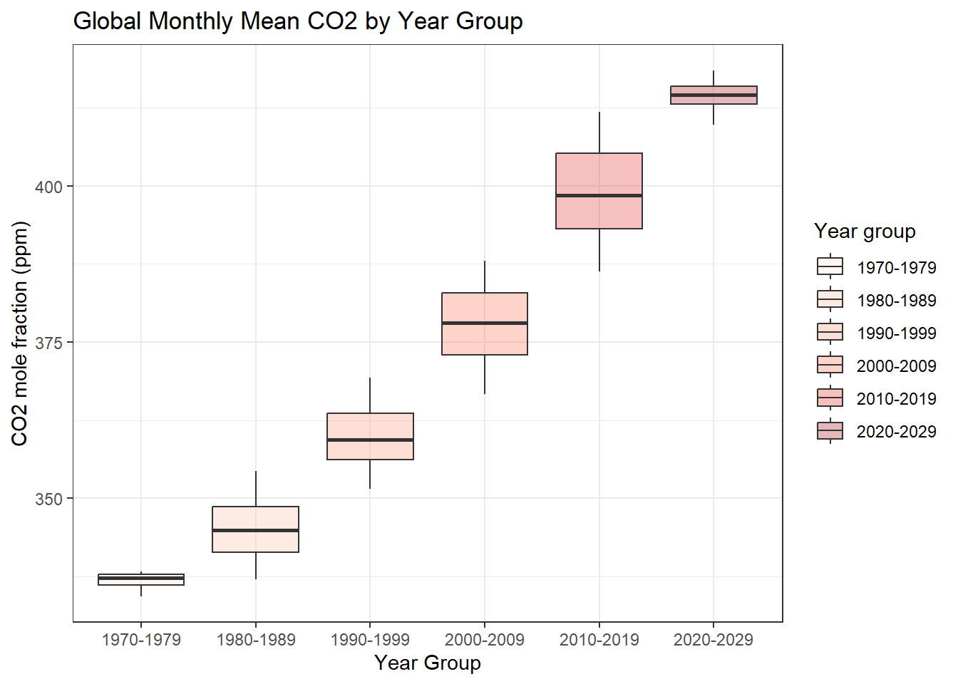
Boxplot
Suppose we want to look at CO2 distribution by year
ggplot(data = co2, aes(x=year_group, y=average, fill=year_group)) +geom_boxplot(alpha=0.3) +scale_fill_brewer(palette="Reds")+labs(x ='Year Group', y ='CO2 mole fraction (ppm)', title ='Global Monthly Mean CO2 by Year Group',fill ='Year group')+theme_bw()
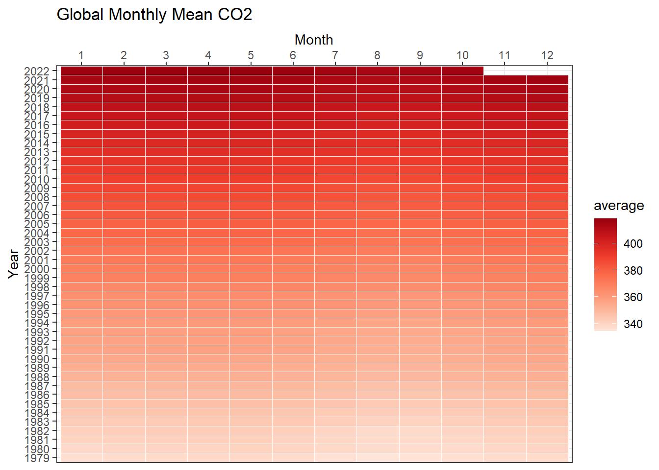
Heatmaps
we are interested to look at the pattern of CO2 concentration by year and month
three data dimensions: year, month, and value of co2
ggplot(data = co2, aes(y=factor(year), x=factor(month), fill=average)) +geom_tile(colour ="white") +scale_x_discrete(position ="top") +scale_fill_distiller(palette ="Reds", direction =1) +labs(x ='Month', y ='Year', title ='Global Monthly Mean CO2')+theme_bw()
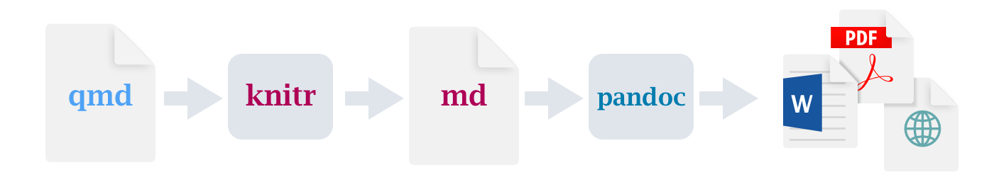
Quarto provides a unified authoring framework for data science, combining your code, its results, and your prose.
Quarto documents are fully reproducible and support dozens of output formats, like PDFs, Word files, presentations, and more.
Like Rmarkdown but better!
Quarto files are designed to be used in three ways:
For communicating to decision-makers, who want to focus on the conclusions, not the code behind the analysis.
For collaborating with other data scientists (including future you!), who are interested in both your conclusions, and how you reached them (i.e. the code).
As an environment in which to do data science, as a modern-day lab notebook where you can capture not only what you did, but also what you were thinking.
List of Quarto formats
Basic documents in html, pdf, docx
Presentations in beamer, pptx, and revealjs (html slides)
We can then create a new Quarto document within RStudio: “File” -> “New File” ->“Quarto Document”.
The Quarto R package is a convenience for command line rendering from R, and is not required for using Quarto with R.
install.packages("quarto")
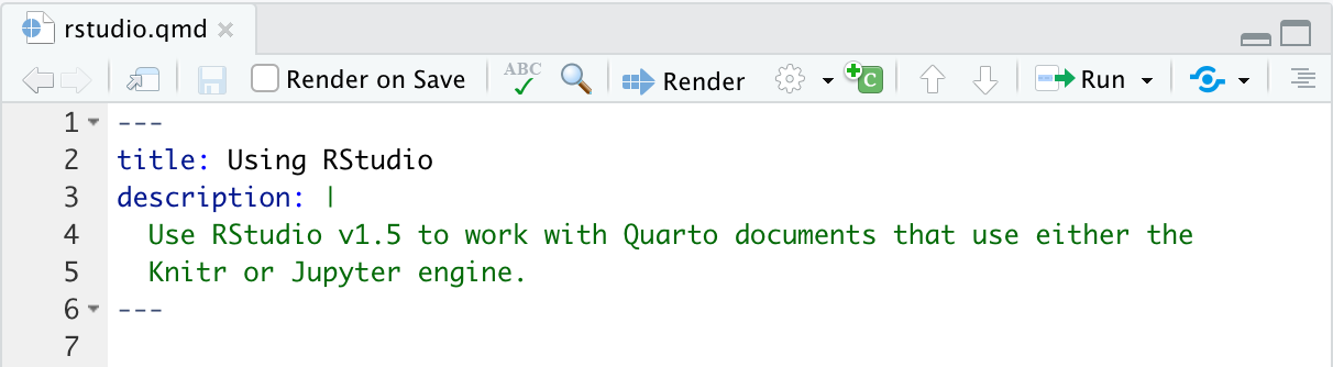
After opening a new Quarto document and selecting “Source” view, you will see the default top matter, contained within a pair of three dashes. This is also known as the YAML header
Top matter consists of defining aspects such as the title, author, and date. It is contained within three dashes at the top of a Quarto document.
For instance, the following would specify a title, a date that automatically updated to the date the document was rendered, and an author.
An abstract is a short summary of the paper, and we could add that to the top matter.
By default, Quarto will create an HTML document, but we can change the output format to produce a PDF.
You can also use this section to define global options!
---
title: "My report"
author: "Name"
date: 2023-09-07
abstract: "This is my abstract."
format: html
---
---
title: "My report"
author: "Name"
date: 2023-09-07
abstract: "This is my abstract."
format: pdf
---
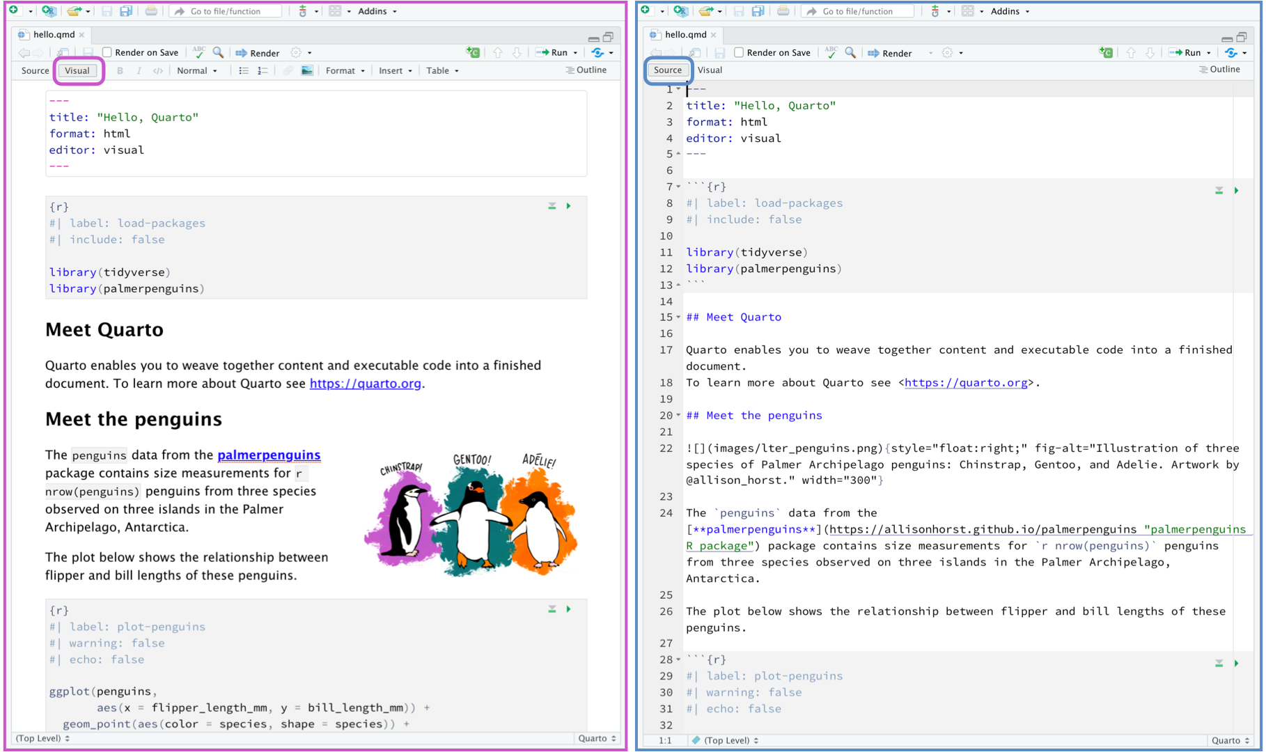
Source editor
You can use visual editor or the source editor to edit Quarto document
## Text formatting
*italic* **bold** ~~strikeout~~ `code`
superscript^2^ subscript~2~
[underline]{.underline} [small caps]{.smallcaps}
## Headings
# 1st Level Header
## 2nd Level Header
### 3rd Level Header
## Lists
- Bulleted list item 1
- Item 2
- Item 2a
- Item 2b
1. Numbered list item 1
2. Item 2.
The numbers are incremented automatically in the output.
## Links and images
<http://example.com>
[linked phrase](http://example.com)
{fig-alt="Quarto logo and the word quarto spelled in small case letters"}
## Tables
| First Header | Second Header |
|--------------|---------------|
| Content Cell | Content Cell |
| Content Cell | Content Cell |
code chunks
Chunk label
Chunks can be given an optional label, e.g. - allows easy navigation of coding sections using the navigator drop-down (bottom-left of the script editor) and easy label reference to code chuck generated figures.
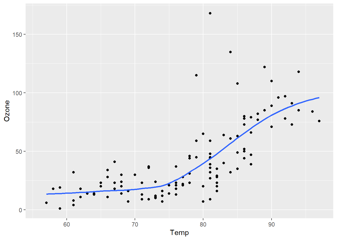
ggplot(airquality, aes(Temp, Ozone)) +geom_point() +geom_smooth(method ="loess", se =FALSE)
Air Quality
Chunk options
Chunk output can be customized with options, fields supplied to chunk header. Knitr provides almost 60 options that you can use to customize your code chunks. Here we’ll cover the most important chunk options that you’ll use frequently. You can see the full list at https://yihui.org/knitr/options.
The most important set of options controls if your code block is executed and what results are inserted in the finished report:
eval: false prevents code from being evaluated. (And obviously if the code is not run, no results will be generated). This is useful for displaying example code, or for disabling a large block of code without commenting each line.
include: false runs the code, but doesn’t show the code or results in the final document. Use this for setup code that you don’t want cluttering your report.
echo: false prevents code, but not the results from appearing in the finished file. Use this when writing reports aimed at people who don’t want to see the underlying R code.
message: false or warning: false prevents messages or warnings from appearing in the finished file.
error: true causes the render to continue even if code returns an error. This is rarely something you’ll want to include in the final version of your report, but can be very useful if you need to debug exactly what is going on inside your .qmd. It’s also useful if you’re teaching R and want to deliberately include an error. The default, error: false causes rendering to fail if there is a single error in the document.
The following table summarizes which types of output each option suppresses:
Option
Run code
Show code
Output
Plots
Messages
Warnings
eval: false
X
X
X
X
X
include: false
X
X
X
X
X
echo: false
X
results: hide
X
fig-show: hide
X
message: false
X
warning: false
X
Render
When a Quarto document is rendered, R code blocks are automatically executed. You can render Quarto documents in a variety of ways:
Using the Render button in RStudio:
The Render button will render the first format listed in the document YAML. If no format is specified, then it will render to HTML.
From the R console using the quarto R package:
library(quarto)quarto_render("document.qmd") # all formatsquarto_render("document.qmd", output_format ="pdf")
The function quarto_render() is a wrapper around quarto render and by default, will render all formats listed in the document YAML.
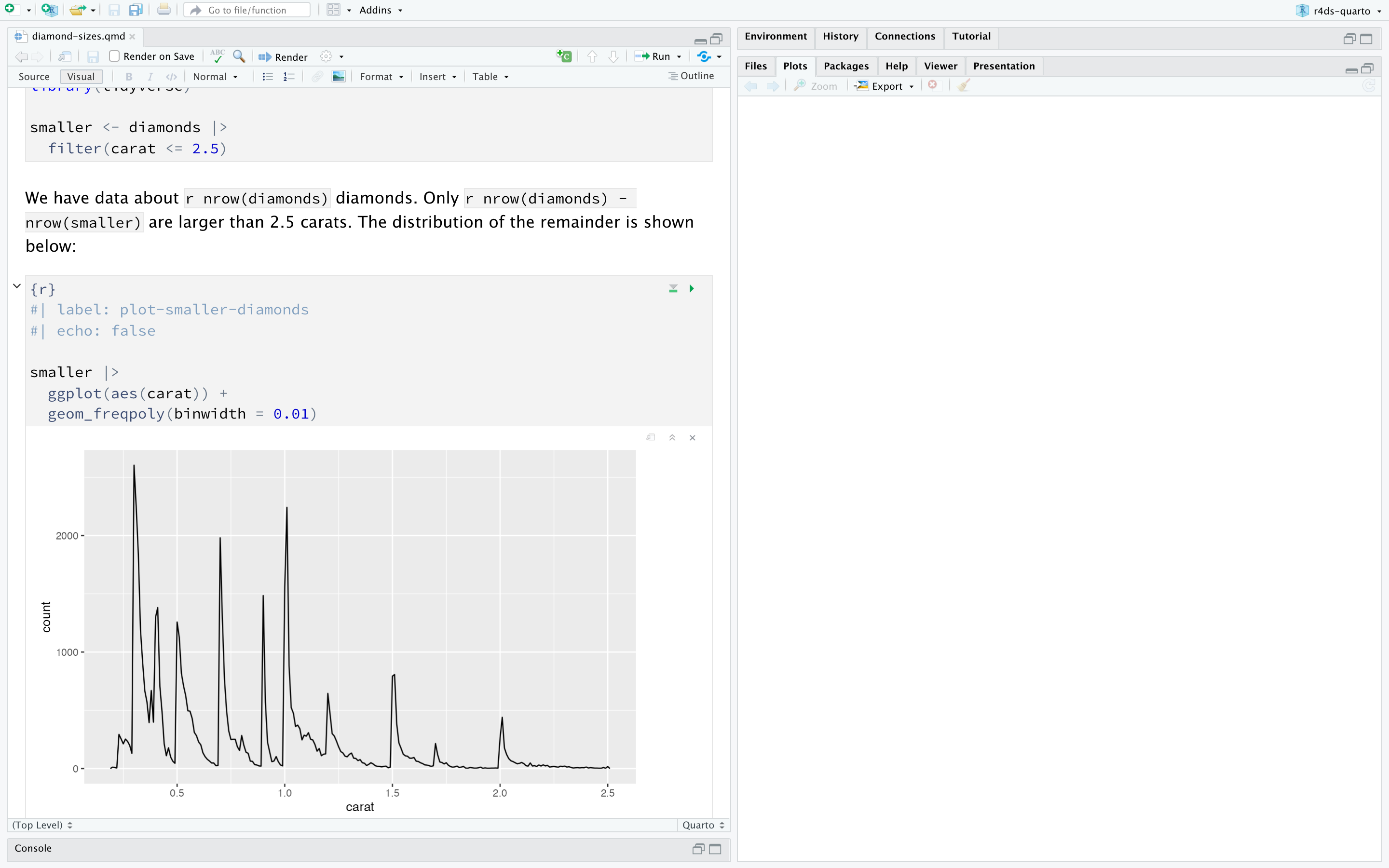
Exercise
Try render the diamond-sizes.qmd document to both html and pdf format
References
Alexander, Rohan. 2023. Telling Stories with Data: With Applications in r. CRC Press.
Cornelison, Terri Lynn, and Janine Austin Clayton. 2017. “Considering Sex as a Biological Variable in Biomedical Research.”Gender and the Genome 1 (2): 89–93.
Wickham, Hadley, Mine Çetinkaya-Rundel, and Garrett Grolemund. 2023. R for Data Science. " O’Reilly Media, Inc.".
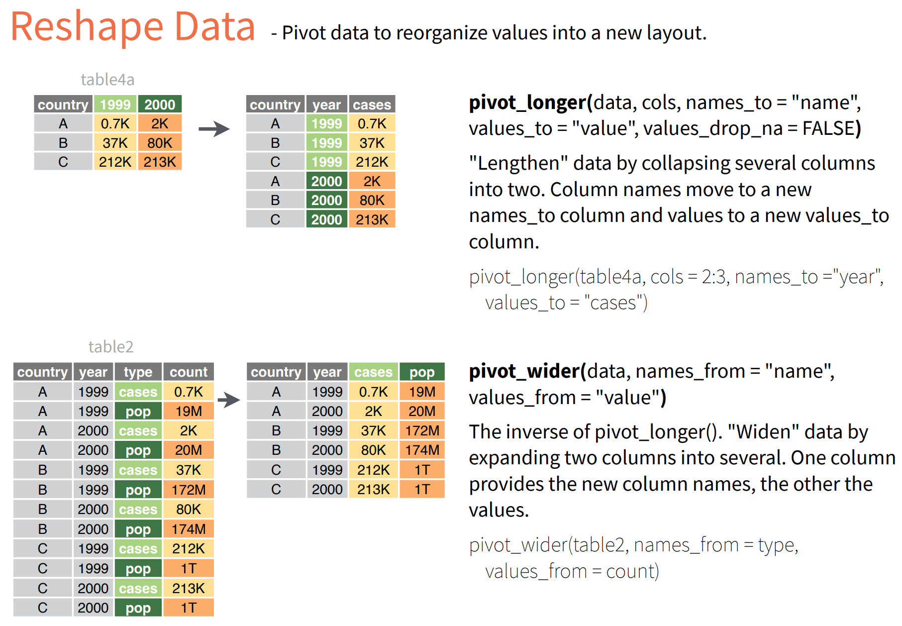 - pivot function has three argumnets:
 > Data visualization is key to data story telling.
 shows a